
On August 19th, at 10am PST I will be giving a Webinar on the topic of visualization. You can register and watch the Webinar right here:
I was giving a talk at RMLL 2010, a french free software conference. The title, Cloud-based Log Analysis and Visualization, already gives the content away. But in case, here is the abstract for the talk:
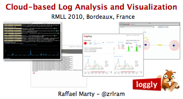
In this presentation we will explore how we can leverage the cloud to build security visualization tools. We will discuss some common visualization libraries and have a look at how they can be deployed to solve security problems. We will see how easy it is to quickly stand up such an application. To close the presentation, we will look at a number of security visualization examples that show how security data benefits from visual representations. For example, how can network traffic, firewall data, or IDS data be visualized effectively?

This small experimental project was done for the Shadowserver Foundation. They are a volunteer, Not for Profit organization who deal in the capture, analysis and dissemination of data and intelligence relating to nefarious activity on the internet. Shadowserver provided us with one day worth of data (which was several gigabytes) for us to apply some known techniques, and experiment with some new ones.
The idea of this project was simply to provide some ideas as to ways to represent their massive datasets visually. There's lot of work to go, however here are few early ideas. My favourite is a light-hearted time series visualization in the theme of an old favourite arcade game originally released in 1972 "Pong".
See all of the samples at http://dataviz.com.au/shadowserver/ideas.html

One of many tests with Afterglow, visualizing SSHD brute force logins (yellow) vs source IP addresses (green).
This one shows quickly the IPs that have the most activity (one IP has the most: the yellow explosion in the middle), along with popularly attempted userids, and the IPs which have been attempting the same userids.
Opinions sought from those working in the relevant areas - handed this document in as part of a degree project in security visualisation & monitoring, and the feedback was that the network and monitoring station/s are not realistic, and that I should have focused on port 80 and layer 7 traffic only, as layer 4 is not relevant any longer. The link provided below is only part of the document, I presume it's the part they had issues with. I wasn't actually intending to focus on web traffic, which was made clear in the document anyway (tho I did indicate to them that with the likes of Rumints packet contents visualiser, it is certainly viable to utilise that to match up with malware signature databases - but that aspect wasn't the focus of the project).
I don't expect it says anything that people working in those areas will be unaware of, and the general intention was to address what would be required for a monitoring station / network, which includes visualisation software, that would work in real-time as well as offline analysis and traffic capture.
The grouping into 'objectives' is just part of how the work has to be presented to comply with guidelines. Cheers for input, I know you're probably busy.
http://docs.google.com/fileview?id=0B2FJ1rXW3lv4Y2UyMGFlZmYtMWE3OC00MmNlLTk4ZDktMmEyNjdhODYxM2Iy&hl=en
nb - the last part is probably wrong about ad-hoc IPs; I can't remember exactly right now how they are handed out; they probably aren't always dynamic esp. now it's more common to get fixed-IP SIMs.

I finally got my spam stats up and running. The results are amazing.
Lightyellow = Subject || Red = Sender || Black = Recipient
It is pretty easy to find the one user that appears to get a significant amount of Spam :). If I had to guess, I would say the single subject, large source and large destination likely originate from Botnets?
The results are from Wed and Thurs of last week.

I extracted this image using PDF malware that I got for analysis purpose. By using perl script I filter out the unneeded content and later put it in sctest(libemu tool). The graph created using dot command in Graphviz package
Afterglow has been on my list of 'neat tools' for quite some time. Thankfully, last month I finally had a bit of spare time to really play with it.
The result was EDV: http://www.pintumbler.org/code/edv
See the page for more info. Keep in mind, this is BETA!
It currently supports Snort (Sguil DB format). However, even the untrained eye can easily modify it for straight Snort
or anything else you can MySQL query. Once you have your sources defined it will take care of the rest.
The tool is static (controlled by configs and cron) for now but I do plan on adding a query tab to the web page so that you can do on the fly queries. Low priority for now. I have been focusing on 2 parsers that log directly to MySQL. One parses Syslog output from a Barracuda spam firewall and the other URL info captured by URLSnarf. These will be my next additions.
Comments and suggestions welcome.
Thanks.

This graph is automatically generated by the Dorothy framework anytime a new malware is analyzed.
It aggregates three different kind of information : 1) the network activity 2) the dns host resolutions 3) the GET / POST resquest
In this way, we can be able to easily define certain activity related to botnet communications.
A quick legend :
Colors :
Green = Services / hostnames
Red = General target
Purple Red = Known C&C ( in this example there isn't any)
Purple = C&C Web target
Light blue = private network host
Shapes:
Circle = Target
Triangle = Source
The shape's dimension represent the network activity related to that node.

I created the image by using Nepenthes' log, later put the country info by using python-geoip. Finally, use Afterglow and graphviz to illustrate them.

click here for the full picture
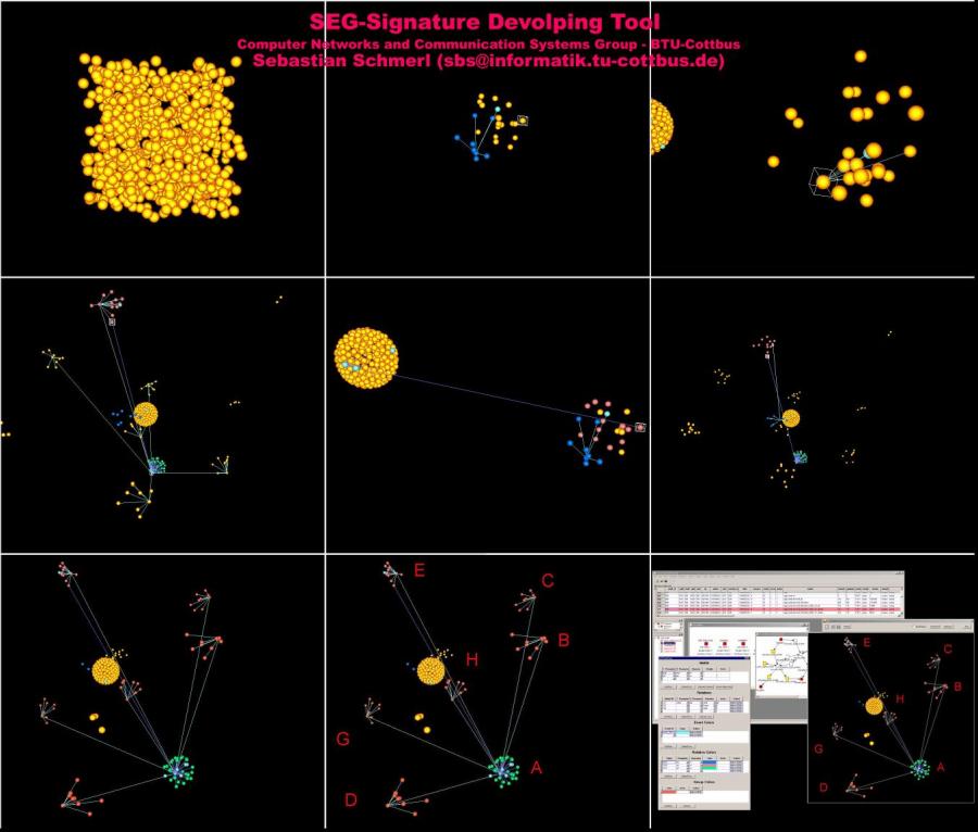
The effectiveness of intrusion detection systems, which apply misuse detection, strongly depends on the conciseness and topicality of the applied signatures. Imprecise signatures heavily limit the detection capabilities of the intrusion detection systems and lead to false positives. The reasons for this detection inaccuracy can only to a lesser extent be imputed to qualitative restrictions of the audit functions. Instead, these restrictions must be identified primarily in the signature derivation process itself.
In particular, the derivation of signatures starting from given exploits appears to be a very complex task, which comprises identifying the traces in the audit data that are left behind by an attack and determining characteristic relations of the attack. This procedure requires also a manual audit data analysis. Admittedly, this basic activity is time-consuming, sophisticated, and cumbersome. The main reasons for these difficulties are the flood of very fine-granular information distributed to different sources as well as the non-ergonomic inspection of audit data.
Consequently, abstraction capabilities to extract relevant parts of this data richness are crucial, but common tools for audit data analysis do not tackle this issue. Abstractions, i.e. the goal-oriented accentuation of relevant relations between audit events, while concurrently hiding irrelevant data are a key aspect to support the security officer during audit data analysis. Another key aspect impacting the time requirements of the analysis is the representation of the data to be analyzed. Typically, a textual representation of audit data is used, which only inadequately allows to illustrate relations between audit events and thus is suboptimal for providing a holistic view on system behavior. Unclearly arranged representations are irritating and lead to wrong assessments and conclusions. These drawbacks can be remedied by using a graphical multi-dimensional representation of audit events.
We developed the tool ADO for three-dimensional representation of audit data that can be explored interactively. The user can create arbitrary views on the data and can study and visualize relations or dependencies of the data. Furthermore, the tool ADO is a part of the signature development tool, which supports the knowledge transfer from identified attack relevant relations between audit data and the actually signature modeling.
The current version of ADO supports BSM (Solaris Basic Security Module) audit logs as input data. Our ADO tool consists of the three components sensor, the analysis and transformation component, and the presentation component. The sensor transforms BSM audit events into a common data structure and provides the data to the analysis component. The analysis component allows the user to define metrics and to adjust particular abstraction parameters. These settings control the quantitative analysis which is followed by a space-specific transformation. The resulting three-dimensional virtual audit data world is turned over to visualization component, which offers the user visualization and interactive exploration capabilities.
The picture shows the single stages of an exploration of an attack on a Solaris system by using ADO. Starting from the picture in the upper left part the signature engineer explores a set of audit events and identifies and visualizes attack relevant relations in these events. The picture in the lower right part shows our SEG-Tool with the audit data visualization tool ADO and the other signature modeling components.

You can find more info at Troyak-AS and Peer activity blog entry
It's been a pretty quiet day today, but I noticed an intersting pattern emerge. I hadn't seen it before, which is really strange considering I work at a college. Im using Sphere of Influence 3.0 summary window and timeline from a Cisco ASA.
In patten "C" I show the normal allowed network traffic. (the horizontal "bars" of traffic are a p2p program not associated with WoW) This shows traffic both into and out of the college. I noticed the patten and highlighted it some more. This showed me the organization. Now if anyone knows anything about world of warcraft the organization was blizzard communications. I filtered all traffic to and from organizations with the word blizzard in them. As you can see from pattern "A" it shows clearly a world of warcraft traffic patten - updating itself is the easier pattern to spot. I also filtered the traffic in pattern "B" denied window. The traffic being denied is port 3724...voice. The timeline (Pattern c) assured me that traffic was indeed seen on 3724 (WoW port) Although tempted to put in a QOS statement to slowly grind that machine to a crawl, I opted for the easier solution. It came from a library computer. So it was just a simple matter of visiting the library and removing the software off a machine that somehow was unfrozen. Freezen the machine and updating a few rule sets.
Patterns always interest me, just thought I'd share this one with you all.

I used a perl script to convert syslog Symantec A/V logs to CSV files and loaded the data into Advizor Analyst. This type of graph shows interesting re-infection patterns for individual hosts (horizontal lines), signature updates following malware blooms (vertical patterns with the same colors) as well as others.

Equilibrium Networks' visual network traffic monitoring software (for background information, see http://www.eqnets.com) has successfully passed our internal tests, so we are packaging a Linux-oriented beta distribution that is planned for snail-mailing (no downloads--sorry, but export regulations still apply) on a limited basis before the end of the month. The beta includes premium features that will not be available with our planned free/open-source distribution later this year, but at this early stage we will be happy to provide a special license free of charge to a limited number of qualifying US organizations.
Participants in our beta program will be expected to provide timely and useful feedback on the software, e.g.
• filling perceived gaps in documentation
• proposing and/or implementing improvements
• making feature requests or providing constructive criticism
• providing testimonial blurbs or case studies
• etc.
The software should be able to run in its entirety on a dedicated x86 workstation with four or more cores and a network tap (though you may prefer to try out distributed hardware configurations). If your organization is interested in participating in our beta program, please include a sentence or two describing your anticipated use of this visual network traffic monitoring software along with your organizational background, POC and a physical address in an email to beta [at (same domain name as our website)]. DVDs will only be mailed once you've accepted the EULA. Finally, bear in mind that beta slots are limited.
We added a URL's visual to the pix/asa..so now we collect the URL's...this helps when monitoring a system as you not only see the connection, like in the old way, but now you see the urls ....As per usual you can filter it so as to look for particular organizations or countries...but using the key word you can also hunt for anything in the url...be useful if hunting C2 traffic for infections
This is a snippet of a report written for an honours project I'm doing on security visualisation. Just some ideas I want to punt out there, cause it'd be nice to see them take off, & in case they've gone un-noticed because of their being in different topic areas,
Visualisation software for security can be used to display graphical information about the data being captured in real-time and also used for offline analysis. The difference between visualisation applications and the monitoring software of the previous objective is in the presentation of the data, although both kinds can and do make use of the more familiar graphs, such as line graphs, bar charts, pie charts, flow charts.
In general, information visualisation is a way to gain insight into complex datasets and textual information in a condensed and understandable way.
Consequently, evaluating a tools effectiveness means taking into account multidisciplinary areas knowledge of visual systems. Successful visualisation tools take into account user interface design, human-computer interaction, psychology of human perception, machine pattern recognition, and are as much borne from certainly the design side of art as they are about presenting quantified data.
To some extents this kind of information visualisation is quite new, and at its current stage is itself viewable as an overall discipline at a time before its emergence as a distinct discipline; but at the same time the areas that will feature heavily in its development are burgeoning in somewhat unnoticeable ways. For example, the prevalence of touchscreen mobile communications devices, whose interfaces are so intuitive and easy to pick up that many people only need a general idea – like another graphic that shows them in use – of how the interface works to be able to use it correctly. It feels natural enough to be able to press buttons with symbolic and pictorial representations of functions, go to the next page using a sweeping motion, zoom in and out to gain more precise datasets or larger overviews using hardware or onscreen rollbars and sliders, manipulating the onscreen display by tilting the device itself; the world wide web itself was designed from the outset as a distributed hypertext system. This sounds obvious as it is well known what the H in HTML stands for, but the framework itself is another example of a new idea (though clearly built upon cross-indexing, as used in libraries) that people find easy to accept without really noticing it – the amount of extra data conveyed within a document using an tag, navigation made easier with anchors, the hypertext links themselves that allow keywords when activated by a button click to jump to another document with further information in relation to the keyword, the use of tabbed graphical browsers – these web basics are so integrated to the user precisely because they use intuitive design interfaces.
The same ease of information access is also behind why it is so frustrating for the user to have the desktop or interface become slowed down and cluttered with unwanted elements, which aside from being relevant to the overall objectives of this project (as spam and other malware and adware are certainly cumbersome additions to any user experience) give very good design tips of what to include and not include in a graphical console.
To some extents the development of information visualisation has been impeded because the hardware is either too expensive, spacious, or simply not available yet, therefore not able to keep up with the code requirements of the applications or the amount of data needing to be accessed, sorted through, processed. As previously mentioned, clustering is definitely a viable solution to many of the problems slowing down development. Parallel computing and information visualisation station design are very complimentary, as the latter greatly benefits from incorporating the former; this is easily understood by merely counting the amount of nodes being monitored in a given network, and considering that the monitoring station has to capture, make sense of (to various degrees), and possibly interpret and present, and certainly store or produce hard copies in realtime, for all of the nodes combined.
Video game hardware and onscreen interfaces, and music visualisers, are another two areas where a lot of progress has already been made that can be directly lifted and incorporated into information visualisation.
Like lightpens and graphics tablets used for a long time in artistic and photo editing digital applications, devices that offer remote pointing that manipulates onscreen elements are very useful to someone sat far back from multiple monitors, as the interaction is required but their field of vision has to be able to take in all the displays.
There are other existing solutions here also, particularly in the field of wearables, such as being able to fit large display formats inside regular sized glasses, and using one-handed small footprint keypad controllers.
Again, other existing areas have already taken multifunction keypad concepts onboard – gaming and video editing decks being prime examples. These allow complex functions to be executed with a key press, by assigning the desired functions as hotkey shortcuts.
Onscreen GUI menus in games offer the user at-a-glance statistics and information as well as easy access to point-of-view changes, and commonly offer the same information on teammates and enemies – it can be seen how this can be utilised in realtime security monitoring, to track multiple connections and see data on them continually updated, monitor a collegues progress, and shift between emphasis on varying datasets without having to minimise or close any displays.
Online and network gaming network configurations themselves have to deal with multiple users changing the game elements on a constant basis, and be able to update the changes and present them to all users in a synchronised way, so everyone is interacting with the same scenario. This is for now more successful in some places than others, purely because of latencies and the haphazard manner that packets may traverse the internet, and also of course based on the users own hardware and the features offered by their ISP and the associated telecoms infrastructures. However the framework itself is available and in a LAN environment can be demonstrated to work very well.
Graphics cards have also developed greatly in recent years, to the extent that what would have required a dedicated visualisation station can now be done on a home PC with one to four graphics cards. GPU and CPU hybrid systems are already in the Top 500 Supercomputer listings and the main hardware chip vendors are or have already been focusing a lot of attention on GPU development.
Music visualiser applications can also be adapted to instead of matching the visuals to audio events, to match them to network or other data events. This is a very promising area as baselining can be used to produce a backgrounded pattern or visual of the networks behaviour, and therefore any fluctuations are readily noticeable even to someone knowing nothing about network data itself.
Use of colour and shading types is also very relevant, and comes out of areas like topography. Many current security and network visualisation tools allow the user to alter colouring of data elements to suit themselves; this is another important consideration of a user interface and from a security point of view is a welcome feature, as user view customisation makes it potentially less obvious to an intruder what the data represents. Of course in collating and sharing data between the authorised users, means there has to be a means to easily combine differing views, which can be done with mapping and parsing.

 event data")
