
I had created two visualization under the scope of GSoC 2011 Honeynet Project. The main aim was to create a 3D mesh with heat map tiles on a world map. The first visualization is a quick proof of concept though the second one is created by using Processing visualization framework.
Please check the documentation site to get detail information and leave me your feedback. The site includes links to demo sites also.
After re-implementing some parser code in difftree with bug fixes and improved bounds checking, I have ported those changes back to quickparser. So, I now present the new and improved quickparser v0.5 with less bugs and more bounds checking. Re-energized after touching the code, I am working on the template based version, which will not be limited to syslog style, key=value formatted logs.

This is my third try at graphing SSHd logs from honeynet.org's Challenge 5. I'm in the process of switching from Perl to Python, so I used Python this time along with Chart Director. However, this is a blatant knock off of Nathan Yau's much better chart: http://flowingdata.com/2011/06/13/largest-data-breaches-of-all-time/. I was just curious to see if I could recreate it with Python and Chart Director using different data.
If you're not familiar with SSHd logs:
"F" stands for "Failed" meaning the wrong password was tried.
"I" for "Invalid" meaning the wrong username was tried.
"A" for "Accepted" meaning the login attempt succeeded.
The numbers show how many "F", "I" or "A" were caused by the IP.

This is my second try at graphing SSHd logs from honeynet.org's Challenge 5. Perl and Chart Director were used to make this chart. The chart has a lot less "chart junk," and is much easier to understand the percentages than my first attempt. Red means there was at least one successful login, while blue means all login attempts failed.
This weekend I spend my time at Data Insight SF. It was a competition where teams were given a data set to visualize. The outcomes were pretty impressive (I might post pictures of the results later). While the teams were working on their projects, various people taught workshops. I was one of them and I talked about the Visualization Lifecycle.
Join us for data in sight: making the transparent visual, a hands-on data visualization competition held June 24-26 at Adobe Systems, Inc.’s office in San Francisco. Coders, programmers, developers, designers, scientists – anyone who believes that data is divine and has ideas for bringing it to life – are invited to join in the fun.
The program begins Friday evening with a session introducing the data sets and tools and a chance to form teams. Saturday kicks off with inspirational talks by data visualization experts from the Netherlands and Switzerland — Dutch graphic designers from Catalogtree and LUST and Switzerland-based interaction designers from Interactive Things. Then it’s down to business, as you roll up your sleeves and get hacking on a data visualization of your own.
Awards will be presented at the end of the weekend for winning projects in the following categories: best dynamic presentation, best fusion of multiple data sets, most actionable, most aesthetically pleasing, most creative, and the ever popular People's Choice award! (Bonus points for the best use of Swiss or Dutch data.)
More details online at www.datainsightsf.com

Plotted exit nodes on maps. Full details on page of Tor Exit Nodes Visualized. Links to images on page are dynamic and updated daily. Uses Google Dynamic Map chart visualization tool.

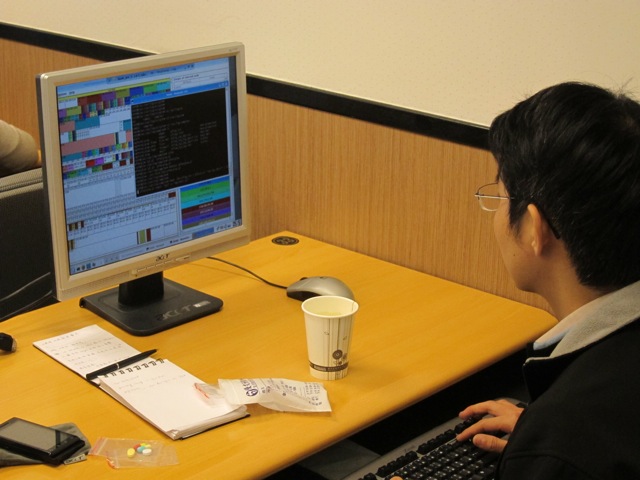
Mid March I taught a Log Analysis and Visualization class in Taipei, Taiwan. I had a total of about 35 students spread over two classes, each of them lasting for two days.
The first part of the workshop focused on the application and use of log analysis with a number of tools. We looked at Splunk with topics like advanced searches, lookups, and alerting. We then looked at Loggly and learned how to use the logging service to analyze logs and build mashups against it.
The remainder of the workshop explored the world of data analysis and visualization. Using today's state-of-the-art data analysis and visualization techniques, we looked at how we can gain a far deeper understanding of what's happening in our networks. How can visualization techniques be applied to understand packet captures or network flows instead of just producing pretty pictures? We explored how to uncover hidden patterns of data, identify emerging vulnerabilities and attacks, and respond decisively with countermeasures that are far more likely to succeed than conventional methods. As part of the workshop we looked at the insider threat problem and had a brief look at how host-centric (as opposed to network centric) analysis can help completing the picture of an incident.
The entire workshop is based on open source tools, such as AfterGlow or Treemap. The attendees got an overview of log aggregation, log management, visualization, data sources for IT security, and learned how to generate visual representations of log data. The workshop was accompanied by hands-on exercises utilizing Splunk, Loggly, and the DAVIX live CD.
The following is the agenda of the entire two days:
Data analysis relies on data. This section discusses a variety of data sources relevant to computer security. I show what type of data the various devices generate, show how to parse the data, and then discuss some of the problems associated with each of the data sources.
DAVIX is a Linux distribution that is used to analyze log data. This class is using the latest version that also has Splunk installed to provide an environment for the students to work on the exercises.
This section is giving an introduction to log management concepts, such as aggregation, parsing, connectors and agents, log archiving, and correlation. The logging landscape has drastically changed in the last years. We will see where things are at, how the cloud has changed log management, and what tools are being used nowadays. This will cover not only some of the commercial tools, such as Loggly, but also show a number of open source log management tools, such as Snare, syslog-ng, and rsyslog.
In order to make log data actionable, the data has to be manipulated and transformed into a form that can be processed by analysis tools. I will be showing a variety of methods (e.g., regular expressions, UNIX commands) to process logs.
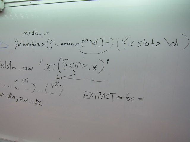
This section on Splunk is going to give an introduction to the Splunk log analysis capabilities with an overview of different data processing methods, such as input configurations, field extractions, the use of event types, and application of tagging for event data.
Once Splunk is setup to receive data and it processes the data correctly, we can start to analyze the data. This section is going into the topics of running statistics on the data, summary indexing, trend reporting, using regular expressions for searching, etc.
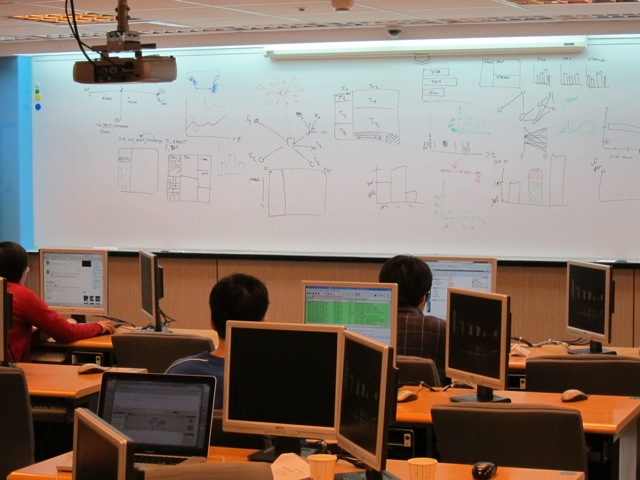
This section introduces some basic visualization concepts and graph design principles that help generate visually effective graphs. It also gives an overview of graphs like treemaps, link graphs, or parallel coordinates, and how they can be used to visualize data.

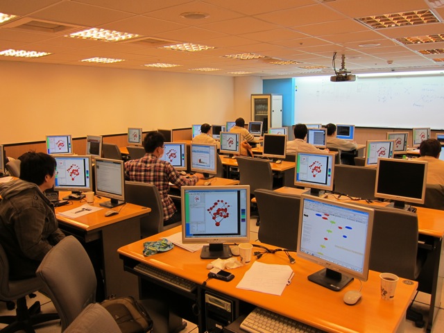
After a short introduction to different data formats used by visualization tools, this section then discusses visualization tools and libraries. The Data Visualization and Analysis UNIX (DAVIX) distribution will be used to show most of the visualization tools. I will show how simple it is to generate visual representations of log data and how tools can be leveraged to visualize information. The theory is then backed by a number of exercises that allow the students to deepen the understanding of the tools and methods.
This section is a collection of use-cases. It starts out with a discussion of use-cases involving traffic-flow analysis. Everything from detecting worms to isolating denial-of-service attacks and monitoring traffic-based policies is covered. The use-cases are then extended to firewall logs, where a large firewall ruleset is analyzed first. In a second part, firewall logs are used to assess the ruleset to find potential misconfigurations or security holes. Intrusion detection signature tuning is the next two use-case. The remainder of the section looks at application layer data. Email server logs are analyzed to find open relays and identify email-based attacks. The section closes with a discussion of visualizing vulnerability scan data.
A topic often forgotten in security data analysis is the treatment of host-based logs. There is a great amount of information that can be collected directly on end systems. This information can be invaluable in forensic investigations. This section explores what these data sources are and how they can be used. In addition, this section will show how this data can be cross-correlated with network-based data.
Packet captures are a very common and rich data source to identify attacks and understand the details of attacks. This section is going to explore how Splunk can be used to analyze packet captures effectively.
This is some software called Gibson that I wrote in python using the Panda3D game engine. It currently takes input from intrusion detection systems and displays their interactions with nodes in your network as it receives them. In addition to 3 axes, it uses direction, color, time, etc. to visually organize the data. I'm working on improving the interface and expanding the types of data it will map. Very much in alpha phase of development, but I'd love feedback! Watch the video, it shows it better than a static picture.

The traceroute program has been a established tool for networking and network trouble shooting. It helps determine the path that packets take as they travel over the Internet, but is limited that it can only give you a linear picture, to a single IP address. With the polytraceroute.sh bash script and the afterglow visualization program, you can get a better idea of how your local computers are connected to each other. It uses a combination of traceroute or tcptraceroute, and arping to gather the information needed to create the plot. It uses arping to find all computers in your local subnet, and then picks random IP addresses to find the possible paths available out onto the Internet. In the picture, my IP is 192.168.0.100.
")
http://dataviz.com.au/blog/Visualizing_VOIP_attacks.html
Through our support of the Honeynet Project, we recently attempted a new approach to visualizing attacks on their VOIP honeypots.
With the increase in popularity of VOIP telephony, attacks are becoming more prevalent. The compromise of a VOIP system can cost the victim over $100,000 in real cash. For example, an Australian based company suffered $120,000 in toll fraud as a result of a VOIP compromise.
The video is intended to be a high level (if not stylized) visualization of the early stages of a cyber criminal compromising a VOIP system.

I used Perl and Chart Director to make this trellis chart. The data are from SSHd logs obtained from Challenge 5 at honeynet.org that has been over for a while now.
The charts are sorted by the total number of bad logins. If there was at least one accepted login and the total number of bad logins were greater than the accepted logins, the attack succeeded and the bars are red. Blue means the attack failed. As you may be able to tell, the Invalid, Failed, and Accepted percentages were calculated by the amount_per_IP / amount_per_all_IPs * 100.
Using wireshark eth.src and ip.src and binding to eth.dst and ip.dst you get an semi-self organized map of devices on the network.
Once you make all IPv4 into CIDR /24 and /16 you have a compressed routing view of the network allowing the trace from traffic generation to Internet in very complex networks.
The ideal view is the Hierarchical view showing interface <> IP Source <> interface <> IP Destination including external networks.
Color coding should demonstrate a row of interfaces, followed by a row of networks followed by yet another row of interfaces.
Hi all,
i'm a student and i'm doing project on visualization. can i know is it possible to do a 3d treemap using this DAVIX? hope to heard from you soon. thank you.
Regards,
Adeline
This year's VizSec Symposium will be held at Carnegie Mellon University, Pittsburgh, PA, USA on 20 July 2011. VizSec brings researchers and practioners from academia, government, and industry to share insights and present solutions to modern cyber security challenges using visualization techniques. Technical papers, speakers, and presentations will be featured in this year's program. If you are conducting research into security visualization please consider submitting a research paper (due by 1 April 2011) or a panel proposal (due by 15 April 2011).
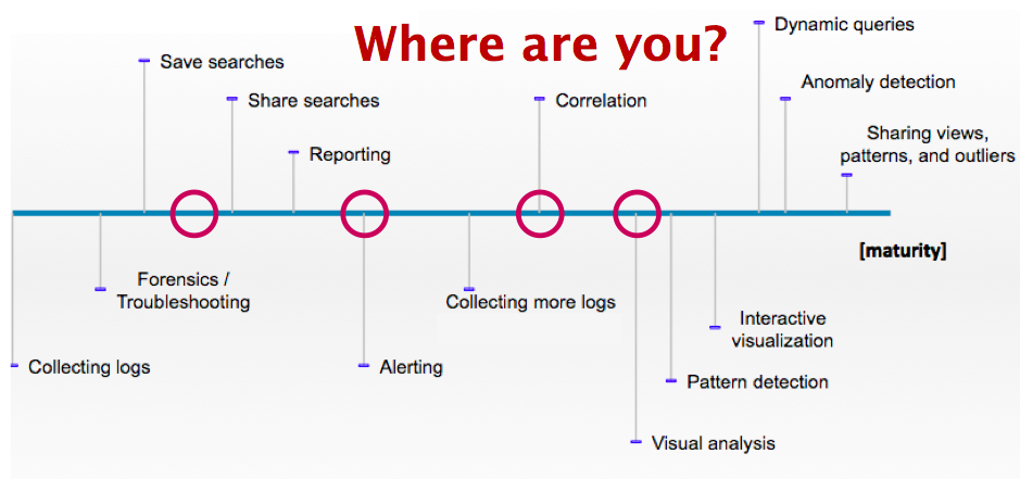
At the recent SANS Incident response and log management summit, I was part of a panel on security visualization. As an introduction, I presented the attached slides on the security visualization trends and where we are today.
I looked at four areas for security visualization: Data, Cloud, Tools, and Security. I started with looking at the log maturity scale that I developed a while ago. Barely any of the present companies could place themselves to the right of correlation point. It's sad, but probably everyone expected it. We have a long way to go with log analysis!
 It's very simple. If you don't have the data, you cannot visualize it. A lot of companies are still struggling to collect the necessary data. In some cases, the data is not even available because applications do not generate it. This is where data analysis or security people have to start voicing their needs to the application owners and developers in order to generate the data that they need. In addition, developers and security people have to communicate more to learn from each other. Ideally, it is not even the security folks that visualize and analyze the application logs, but it is the application people. Just a thought!
What we will see next year is that the Big Data movement is going to enable us to crunch more and bigger data sets. Hopefully 2011 will also give us an interoperability standard that is going to ease log analysis.
 What does the cloud have to do with security visualization? Well, it has to do with processing power and with application development. Applications generate logs and logs are used for security visualization. Cloud services are new pieces of software that are being developed. We have a chance here to build visibility into those applications, meaning we have an opportunity to educate these developers to apply logging in the right way.
 With tools I mean security visualization tools. We are absolutely nowhere with this. There are a couple of simple tools out there, but there is no tool that really does what we need: brushing, linked views, supports large data sets, easy to use, contextualized, etc.
Next year won't really change anything in this area. What we will see is that more and more tools are built on the Web. The cloud movement is kind of responsible for this push, but so is the broad utilization of HTML5 with all of it's goodness (e.g., Websockets, Canvas). We will see advances in the social space with regards to visualization tools. Security will continue utilizing those tools to analyze security data. It's not ideal because these tools are not meant for this, but hey, better than nothing! Maybe this will help creating awareness and will surface some interesting use-cases for security visualization.
 What will we see in security visualization? Well, as we saw earlier, we don't have the data. What that means is that we haven't really had a chance to learn how to visualize that data. And because we didn't have that chance, we don't really understand our data. Read that again. I think this is an important point!
I know, I am painting a gloomy picture. Hopefully 2011 will have some surprises for us!

This is a screen shot of the Tenable 3D Tool which works with SecurityCenter. It can visualize a topology based on Nessus vulnerability scans, change features of each node (color, shape, icon, size, elevation, animation) based on any type of value such as an asset class, political group, technology, .etc. Each node also can have 8 vertical bars (4 up and 4 down) which can be colored based on vulnerability, open port, missing patches, configuration issues, .etc. Each node can also have connection information displayed from IDS, netflow, firewall, login failures, .etc that have been collected by the Passive Vulnerability Scanner or from logs gathered by the Log Correlation Engine. The tool is currently in beta testing and will be available to Tenable customers in early 2011. http://www.tenable.com
Equilibrium Networks' free/open-source visual network traffic monitoring software is now available for download at http://www.eqnets.com. A video of our enterprise system in action and technical documents detailing our approaches to traffic analysis, real-time interactive visualization and alerting are also available at our website.
Besides a zero-cost download option, we are also offering Linux-oriented installation media and an enterprise version of our system with premium features such as configurable automatic alerting, nonlinear replay, and a 3D traffic display.
Discounts—including installation media for a nominal shipping and handling fee—are available to institutional researchers or in exchange for extensions to our platform.
The software can run in its entirely on a dedicated x86 workstation with four or more cores and a network tap, though our system supports distributed hardware configurations. An average graphics card is sufficient to operate the visualization engine.

