
There are a couple of seats open for next week's security visualization workshop in Dubai. The training is held Friday and Saturday, November 9th and 10th in Dubai.
The topics are anything from data sources to log processing to a lot of eye-catching visualizations, and a great module on big data. The signup link contains all the information you need.
Hope to see you in Dubai next week!


.jpg)
A week ago, in Seattle, VizSec 2012 was taking place. I had the honor to present the keynote, which I used as an opportunity to talk about the state of the security visualization space. Here is the video of the talk.
This is a quick outline of the talk:
Following are the slides from the talk. Unfortunately, my video recording from the VizSec keynote failed. I was presenting at Microsoft however, the same week and I was able to record my talk there. Same slides.
The past couple of months have been pretty clean from SPAM in the secviz feed, after I implemented a moderator queue for all the content. This seems to work pretty well. However, the system doesn't let me enable a moderator queue for images in the image gallery. That's why you have seen a few SPAM images in the feed (for example this morning).
I took another step to prevent this. When signing up as a user, you will have to be approved from now on. This seems to be the only way for me to prevent SPAM once and for all. I hope I'll be able to distinguish real users from spammers upon signup. I'll figure that one out.
Looking forward to seeing your posts here!

After a series of Nessus jobs (with hundreds of nodes and thousands of findings) I scrapped together Prenus, the pretty Nessus .. thing. Consuming Nessus XML files and outputting in a few different formats, including Afterglow or Circos formatted files, can help construct these sorts of images. Useful if you have stacks of data. You can read more over here.

The picture shows the hourly amount of network traffic for thousands of hosts in a large computer network for 24 hours. The different nested circles represent the subnet hierarchy of the IP addresses. Each filled circle represents a whole subnet or a single hosts. Each circle consists of 24 segments, while each colored segment visualizes the number of bytes transferred in the respective hour.
More Information and Interactive Demo on: http://ff.cx/clockmap/
AfterGlow cloud has evolved further into another release; with many improvements added to the initial version. With GSoC 2012 approaching an end, we've covered all the additional features we planned for in the second phase of development, post mid-term. Building up on the initial version, this post will run you through the general features and additional improvements covered.
A live demo of this release can be found here: http://andromeda.ayrus.net:8080/
Data sources: In addition to the initial method of uploading AfterGlow compatible CSV file, the application now supports two new methods of visualizing your data. You can now upload your logs straight from the source and have it parsed (to a CSV file) and then, rendered on the fly. Additionally, AfterGlow Cloud is now integrated with Loggly.com's API. Loggly is a service which is used collect log data for monitoring and analyzing the data. With an account at Loggly, you can now search and import your logs straight from Loggly and have it visualized. Your authorization to the application to access your account at Loggly remains on our end for about a hundred days, beyond which you'll have to re-authenticate the application again. You can however revoke access to the application anytime. Both of these new additions, require you to specify a parsing scheme which is covered below.
Log parsing: Logs you upload directly or from your Loggly account have to be parsed initially for them to be visualized later. For this to happen, a regular expression has to be provided which groups two or three columns of data (if you're using two columns you'll have to check "Two Node Mode") from each line in your log. You can either specify a custom expression or select one the 'predefined' expressions. While provided a a custom regular
expression to parse your log, you're given an opt-in choice to save your expression as 'Predefined' for other users to use.
Settings tab: These define general settings over the way you want your final graph to be rendered. For example, "Print Node Count" prints the frequency at which each node occurs in the data uploaded beside the node's label while, "Text Label Colour" lets you choose the colour of text on each node. Each field on the application throughout is appended with a "?" help link. Hovering over this link, will provide you a small tip as to what they're supposed to do.
Advanced settings tab: These settings go a little beyond the general settings. As examples, "Soruce fan out threshold" will give a lower limit on the number of edges originating from each source node. If one or more source nodes don't have the required (threshold) number of edges originating from them, they're omitted on the graph. Same idea applies to "Omit threshold for each node" but with the threshold presiding over the frequency at which each node occurs throughout the data.
Configurations tab: These settings fine-tune your graph and often bring about interesting patterns, useful for visualization. Each fieldset in this tab provide a way to identify properties across the nodes in the graph. Examples: Option 'port' in clustering provides a way to cluster all the nodes with a specific bound for the port they represent. Giving a value of "2000" would mark and cluster (group) all the nodes representing a port higher than 2000 together. 'Number of occurrences' in Size fieldset, will have the size of each node proportionate to the frequency at which they appear throughout the log. A node with a heavy frequency would appear thick and vice-versa. This helps you to notice interesting patterns. If you're very familiar with the way configurations work with AfterGlow you also have the option of specifying these manually using the "Manual" option. You can simply cut/paste from a configuration file or write your configuration file by hand in a textbox. AfterGlow Cloud also saves your configuration every time you render a graph. When you choose to render a graph again, you can simply use your 'last used configuration' and it'd import the same configuration file you used last time. Alternatively, you can 'import' the last used configuration into the manual mode and further fine-tune it manually.
Rendering Engines: The application now supports using dot/sfdp in addition to using neato using GraphViz. More information about these, if you're unsure can be found here.
Gallery: You can submit the graphs you render using the application to a public gallery (with some details of it) for other users to view.
As an example (a very rudimentary example actually), here's how you might parse a typical Apache log. For this example we'll be using a very small portion of the log (attached), parse the client IP and the size of the request from it and try to render it.
We first point to the demo access log file from Apache and since we're uploading a log directory from our source, we'll have to select the "Log" option to have it parsed to a CSV (compatible with AfterGlow) and then render it. We've also checked the "Two node mode" box since, we'll be only extracting two columns (IP/Size) from our data. For the parser, we use a predefined regular expression which extracts the client IP and request size from an Apache log using the Common Log Format:

On the settings end, for some eye-candyness we define an edge length of 1.5 (length of an edge between two nodes) and define the text label colour as white:

Finally, on the configurations end, we add three colour configuration settings. All source node (Client IP) will be coloured with a shade of green. Target nodes (size nodes with a value of more than 2000 -- in this context it converts to more than 2000 bytes) will be coloured red. All the other target nodes will be coloured with a shade of orange. It's important to note here that configurations are read line-by-line hence, the line ordering matters. This type of configuration will show a really simple relation between how many bytes each client has requested in each request, but it will specifically mark the request with more than 2000 bytes in red (say you wanted to visualize the 'heavy' requests):

The resulting graph from these settings looks like:

You can see from the (really simple) example above some of the 'heavy' (we're classifying 'heavy' as >2000 bytes for the sake of an example here) requests from different clients.
From the development perspective, AfterGlow Cloud can now be deployed to a production like environment. The application (and the demo above) README cater to deploying the application on Apache using mod_wsgi. If you wish to run your own instance of the application, you can clone the source from the repository. A detailed README (pertaining to a machine running Ubuntu) is also available to help you setup. The README walks through the complete steps required from scratch to set the environment and the application (to the point that you can get it running on a fresh Ubuntu install without a hassle). The codebase has also been documented in detail, should you wish to fork and play with it.
This release marks the next version of AfterGlow Cloud. Please report any bugs or comments you have using the contact form on the demo :)
With the marking of the mid-term milestone in GSoC 2012, we're happy to announce a first version release of AfterGlow Cloud. After a lot of discussions and review the project seems to be in a good position for an initial release. The project in essential is based on AfterGlow [1], a security visualization tool which facilitates generating visual graphs from data you upload. The tool described at [1] is originally command-line based, the aim of this project, in general is to bring this tool and its options to the cloud -- so as to provide a neat interface for on-the-fly visualizations.
Live demos of the project are currently available at:
This release covers all the basic features discussed and agreed upon initially [2]. You can upload any comma-seperated file (only CSV files) as your log source to visualize it. The current version doesn't cover parsers for exporting logs from different sources (example tcpdump) into CSV -- but this is a future addition, likely in the next release. To have a feel of what the application is capable of, you can try uploading the sample "firewall.csv" file (in the attachments). This sample file contains some rules (pass, block) over different source and destination nodes. Getting any sense of what's exactly going on is difficult by merely inspecting the CSV file -- this is where AfterGlow is needed.
Labels "Settings" and "Advanced Settings" cover some rendering settings you might want to choose or override for better customization. For example, "Print Node Count" would append the number of times each source/destination node occurs in the log file provided -- this gives a sense of the frequency of the nodes. Similarly, "Text Label Colour" provides the option to override the default black colour of text on the graph (You can hover over the "?" next to any input for a description of what they exactly mean).
Configurations are used to further scrutinize the rendering of the graph, for example you might want to colour a set of source/destination nodes "red" if their IP is '68.xx.xx.xx'. Each of these configuration lines bring about several layers of visualization. For example, you'd probably want the 'size' of the node on the graph to be proportionate to the frequency they appear throughout the log (configuration under 'Node Sizes' - 'Predefined - Number of Occurrences'). You can remove or change the ordering (ordering of configurations matter) once a line is added. A detailed guide to the different configuration options available, would be added later.
A sample configuration file is added as an attachment (sample.properties). If you'd like to try this out with the sample "firewall.csv" data file, you could choose "Manual" under the configurations and paste the contents of the file (instead of manually feeding in every line). The application also provides the feature of "saving" your settings. All changes you make in "settings" and "advanced settings" pane are stored as a cookie (for four days) if the save feature is checked. AfterGlow populates your settings every time you visit the application with an active cookie.
Here's how a rendered graph looks like:
Original CSV data:

Graph rendered by AfterGlow on the above data:

The source for the entire projects rests at the GitHub repository. If you choose to run your own local install of the project, detailed instructions are provided in the README. The instructions and requirements listed in the README cater to Ubuntu and run Django's development runserver module (instructions for a production like environment -- Apache would be added later).
With this release, we've started to list out the possible features and additions that can be brought on to the next version of AfterGlow cloud (API, adding parsers to convert data from tcpdump etc to CSV files, among others). There's still a lot to be covered and added so please let us know if you'd like to suggest new features on the project, report a bug or any general comments (a feedback form would soon be added to the current demos)!
Links:
[1] http://afterglow.sourceforge.net/
[2] https://www.honeynet.org/gsoc/slot6
We are a big data analytics company, building the next generation visualization tools for enterprises to help them understand their data for cyber security, fraud, supply chain optimization, etc.
Are you into big data? Are you frustrated that you can't make those huge amounts of data actionable? Want to be part of the founding team of an innovative and fun enterprise company? We are building the next generation data visualization application for big data. We are making enterprise data analytics accessible to the analysts through a fun and beautiful experience. We are leveraging the power of visualization to let analysts without data mining backgrounds explore and understand their data.
We are currently working with some of the world's largest corporations to help them protect and understand their cyber security data.
These are the types of people we are looking for:
This year’s VAST Challenge focuses on visual analytics applications for both large scale situation analysis and cyber security. There are two mini-challenges to test your visual analytics applications and your analytical skills.
In mini-challenge 1, (the imaginary) BankWorld's largest financial institution, the (fictitious) Bank of Money needs your best situation awareness visualizations to understand the health of its global corporate network. How do you visualize status data for a network containing nearly a million computers in a way that you can perceive network health and identify problems?
In mini-challenge 2, unusual events are occurring in one of the Bank of Money's regional offices. Some of them may very well wreak havoc across the institution if they turn out to be malicious. What are these unusual events? And if you were in charge of computer security, what actions should be taken to safeguard the network and quite possibly save the Bank of Money from disaster? (Participants from last year's VAST challenge may find their firewall and IDS log analysis tools useful for this challenge as well.)
We encourage participation by individuals and teams in industry and academia. Creative approaches to visual analytics are encouraged.
Please visit http://www.vacommunity.org/vastchallenge2012 to download datasets and instructions. For more information, please contact vast_challenge@visweek.org.
The submission deadline is July 9, 2012.
We look forward to seeing your creative solutions!
Made from FileZilla log. The IP addresses are fictional!
Transform Drupal log to a picture. This is a part of the whole picture. The IP addresses are fictional!
 At the end of August, I will be teaching a visualization workshop in Iceland. The workshop is part of the Nordic Security Conferene.
The workshop has gotten quite a face lift. The visualization module was updated a lot to include more on graphs and visuals, as well as a little bit more on visualization theory that is immediately applicable to your every day security visualizations. I am introducing many more visualization tools in a hands-on fashion and I am, for the first time, going to teach a module on big data: Hadoop, Riak, Mongo, Flume, etc. What do they have to do with security intelligence and security monitoring? Come and explore the topic with me!
Sign up today!
I recently posted some new video’s to Tenable’s Youtube channel about how to visualize network attack and exploit paths in 3D. The videos are located on this playlist. They make use of data from Tenable’s Nessus and the Passive Vulnerability Scanner products to identify exploitable internet facing systems, exploitable internet browsing clients and exploitable clients that are trusted by servers. There is also a blog post and white paper on this sort of 3D analysis on the Tenable blog.
VizSec 2012 will be held in mid-October as part of VisWeek in Seattle. When we know the exact date, we will update the web site. Papers are due July 1.
The International Symposium on Visualization for Cyber Security (VizSec) is a forum that brings together researchers and practitioners from academia, government, and industry to address the needs of the cyber security community through new and insightful visualization techniques. Co-located this year with VisWeek, the 9th VizSec will provide new opportunities for the usability and visualization communities to collaborate and share insights on a broad range of security-related topics. Accepted papers will appear in the ACM Digital Library as part of the ACM International Conference Proceedings Series.
Important research problems often lie at the intersection of disparate domains. Our focus is to explore effective, scalable visual interfaces for security domains, where visualization may provide a distinct benefit, including computer forensics, reverse engineering, insider threat detection, cryptography, privacy, preventing 'user assisted' attacks, compliance management, wireless security, secure coding, and penetration testing in addition to traditional network security. Human time and attention are precious resources. We are particularly interested in visualization and interaction techniques that effectively capture human analyst insights so that further processing may be handled by machines, freeing the analyst for other tasks. For example, a malware analyst might use a visualization system to analyze a new piece of malicious software and then facilitate generating a signature for future machine processing. When appropriate, research that incorporates multiple data sources, such as network packet captures, firewall rule sets and logs, DNS logs, web server logs, and/or intrusion detection system logs, is particularly desirable.
More information is on the web site:

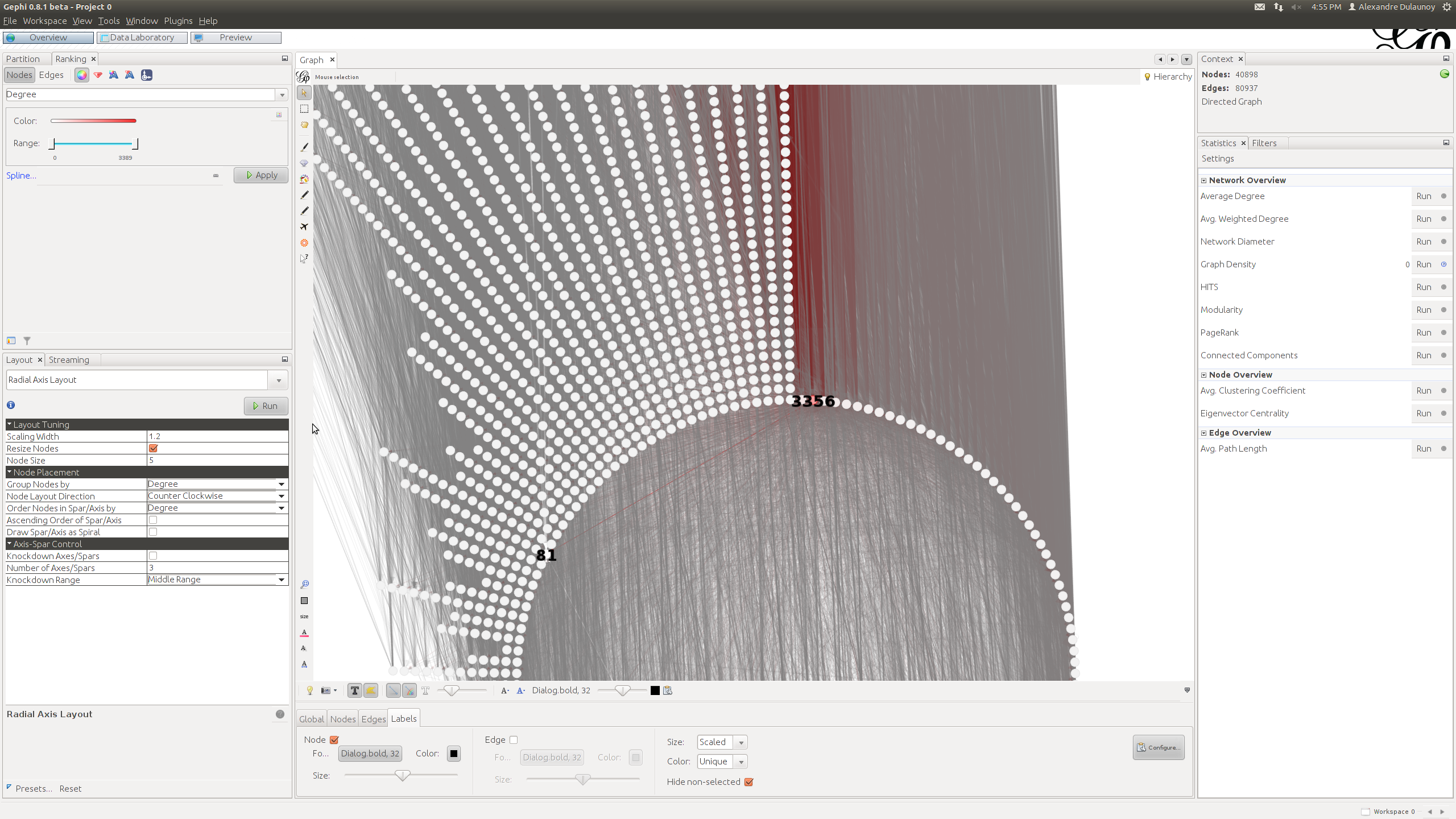
Digging into my various BGP datasets, I decided to create a GraphViz dot files with all the unique AS path in BGP for Internet as of Today. The dot file is available at the following location: http://www.foo.be/internet-dot/BGP-ASN-Paths-20120403.dot (! 44MB) and a quick overview of the dataset with Gephi: http://www.foo.be/internet-dot/Top-ASN-20120403.png. You can directly see the ASN 3356 (Level 3), one of the most connected providers. I used the "Radial Axis" layout that is well suited for such kind of dataset. The internet view (from this BGP router) contains 40898 ASN representing a majority of the ISP on the Internet.
The dataset can be used to experiment Gephi or other tools to handle large graphs with a lot of connections. The dataset will be updated at a regular interval. If you have any ideas, feedback... let me know.
IEEE Network Magazine, Special Issue on Computer Network Visualization has an Extended Deadline, now May 1, 2012
I wrote a small blog post about AfterGlow and how to visualize packet captures. It gives a few examples on how packet captures can be visualized as link graphs.
I then followed up with a post on Advanced Network Graph Visualization with AfterGlow. In this post I show how you can use some extended capabilities of AfterGlow to read configuration parameters from variables and files in order to influence your network graph's colors, clustering, etc.
Curious to hear your feedback!

The picture shows attacks from the Internet to computers located at the University of Konstanz (brute force SSH attacks). The background represents the university’s network structure with computer systems as rectangles. External hosts are shown as colored circles on the outside. The splines represent the connections between attackers and computers within the network. This reveals a distributed attack originating from hundreds of hosts working together in attempt to break into specific computer systems.
More Information on: http://ff.cx/nflowvis/
Call for Papers
IEEE Network Magazine
http://dl.comsoc.org/livepubs/ni/
Special Issue on Computer Network Visualization, Nov./Dec. 2012 issue
Background
Computer networks are dynamic, growing, and continually evolving. As complexity grows, it becomes harder to effectively communicate to human decision-makers the results of methods and metrics for monitoring networks, classifying traffic, and identifying malicious or abnormal events. Network administrators and security analysts require tools that help them understand, reason about, and make decisions about the information their analytic systems produce. To this end, information visualization and visual analytics hold great promise for making the information accessible, usable, and actionable by taking advantage of the human perceptual abilities. Information visualization techniques help network administrators and security analysts to quickly recognize patterns and anomalies; visually integrate heterogeneous data sources; and provide context for critical events.
Scope
This special issue seeks original articles examining the state of the art, open issues, research results, evaluations of visualization and visual analytic tools, and future research directions in computer network visualization and visual analytics. All submissions should be written to be understandable and appealing to a general audience. Research papers should contain a substantial amount of tutorial content and minimal mathematics. Topics of interest include, but are not limited to:
* Uses of visualization for network status monitoring and situational awareness
* Visualization methods employed in the classification of network traffic and its analysis
* Visualization methods enhancing network intrusion detection and anomaly detection
* Visualization methods for the analysis of network threats (e.g. botnets)
* Visualization methods for the analysis of network routing
* Methods for integrating analytics and visualization together for network analysis tasks
* Methods for visually integrating heterogeneous data sources to support network analysis tasks
* Case studies of open source visualization tools in network analysis tasks
* Evaluations of network visualization tools in situ
Manuscript Submission
Articles should be written in a style comprehensible and appealing to readers outside the speciality of the article. Authors must follow the IEEE Network Magazine guidelines regarding the manuscript and its format. For details, please refer to the "Guidelines for manuscripts" at the IEEE Network Magazine web site at http://dl.comsoc.org/livepubs/ni/info/authors.html. Submitted papers must be original work and must not be under consideration for publication in other venues. Authors should submit their manuscripts in PDF through ScholarOne for IEEE Network Magazine. Choose this special issue from the drop down menu on the submission page. Authors uncertain about the relevance of their paper to this special issue should inquire with the guest editors before submission.
Schedule
Submissions: April 1, 2012
Author notifications: July 1, 2012
Final papers: September 1, 2012
Publication: November 2012
Guest Editors
John Goodall
Oak Ridge National Lab
jgoodall@ornl.gov
John Gerth
Stanford University
gerth@graphics.stanford.edu
Florian Mansmann
University of Konstanz
Florian.Mansmann@uni-konstanz.de
