
I've been frustrated with large-scale traffic analysis tools for a long time. I recently did some DNS traffic analysis to study possibilities for detecting DNS tunnels.
I wrote up my traffic analysis thoughts in a study of dns. The result of that paper was thresholds of typical DNS hostname request lengths, at least for my traffic. Not satisfied with a static threshold, I built a visualization for the traffic using processing. The writeup of the visualization is available in part ii.
A picture is attached of dns hostname requests when ssh'ing over dns using dns2tcp. The code is available as well; you can visualize your own captures or live traffic off the wire.
enjoy.
tranq
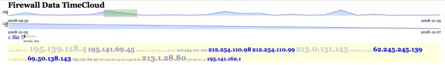
I used a JavaScript tag cloud implementation to visualize some firewall data. I used the source IP address to mimic the words from the tag cloud. Check out a working implementation.
I was just looking at some java script and flash visualization tools: MooWheel, JavaScript Information Visualization ToolKit JIT, Open Flash Chart.
And there it is again, that frustration about data formats. I wanted to try the tools with my own data, just to realize that each and every tool had another input requirements. None of them takes simple CSV input! They want arrays:
var data = [{
             id: 'joeb',
             text: 'Joe B',
             connections: ['ryank', 'charliec']
            },
My favorite - how can I be surprised - JSON. It had to happen. I hate the Web 2.0 people for this. Sorry.
var json = [
{
	"id": "aUniqueIdentifier",
	"name": "usually a nodes name",
	"data": [
	    {key:"some key",       value: "some value"},
		{key:"some other key", value: "some other value"}
	],
All of these formats are just absolutely horrible to generate. I have CSV data, or at least I can generate that easily! Will I really have to write converters for all of this?
 "Log Analysis and Security Visualization" is a two-day training class held on March 9th and 10th 2009 in Boston during the SOURCE Boston conference that addresses the data management and analysis challenges of today's IT environments.
 The students will leave this class with the knowledge to visualize and manage their own IT data. They will learn the basics of log analysis, learn about common data sources, get an overview of visualization techniques, and learn how to generate visual representations of IT data for a number of different use-cases from DoS and worm detection to compliance reporting. The training is filled with hands-on exercises utilizing DAVIX, the open-source data analysis and visualization platform.
The trainer is the author of the book Applied Security Visualization and has been working on log analysis for many years.
Register today to secure your spot.

The image shows data from several FastFlux domains (blue)and their infected nodes (red)
We can see that several FastFlux domains are in the same network, so the nodes are inside several FastFlux networks associated with several domains.
The data has been collected across several weeks monitoring FastFlux domains entries.
Regards
")
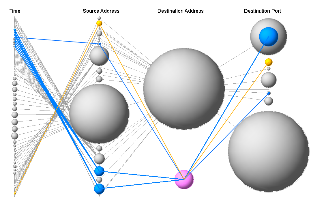
This image shows data from a firewall log. It shows the connections between destination addresses and destination ports.
The script to generate the graph is written in Action Script (Flare). I hacked the sample Flare file: DependencyGraph.as to have it read CSV data, instead of some JSON formatted input. The script is a real hack at this point. If you want a copy, drop me a note. I will gladly share it. Here is the live graph.
Jason, thanks for all your help with the ActionScript stuff!
")
This is an image generated with Flare. The action script parses a CSV file that was generated from a firewall log. It visualizes the connections between the source and destination IP addresses.
Are you looking for a little challenge for the days between Christmas and New Year? Yes? Well, then try the 25C3 visualization contest and win a copy of Raffael's book "Applied Security Visualization". For details regarding the task and submission details see the 25C3 DAVIX Visualization Bootcamp page.
Zenmap is a GUI front end for nmap, the popular network and port scanning tool by fyodor.
Introduction
Zenmap is the official graphical user interface (GUI) for the Nmap Security Scanner. It is a multi-platform, free and open-source application designed to make Nmap easy for beginners to use while providing advanced features for experienced Nmap users. Frequently used scans can be saved as profiles to make them easy to run repeatedly. A command creator allows interactive creation of Nmap command lines. Scan results can be saved and viewed later. Saved scans can be compared with one another to see how they differ. The results of recent scans are stored in a searchable database. A typical Zenmap screen shot is shown in Figure 12.1. See the official Zenmap web page for more screen shots.
Both of these tools were recently released by Utah State University under the GPL license. You can read more about them by following the links, including sample movies that demonstrate how the tools work. The tools were created by Rian Shelley.
IPVisualizer
IPVisualizer is a visualization in which a range of IP addresses are represented as dots on a screen. The shape, intensity, and color of the dot indicate the direction, count, and type of the traffic, respectively.
OIP
OIP is a visualization in which individual machine IPs are placed randomly on a display, and packets are visualized as different sized dots flowing from one machine to another.
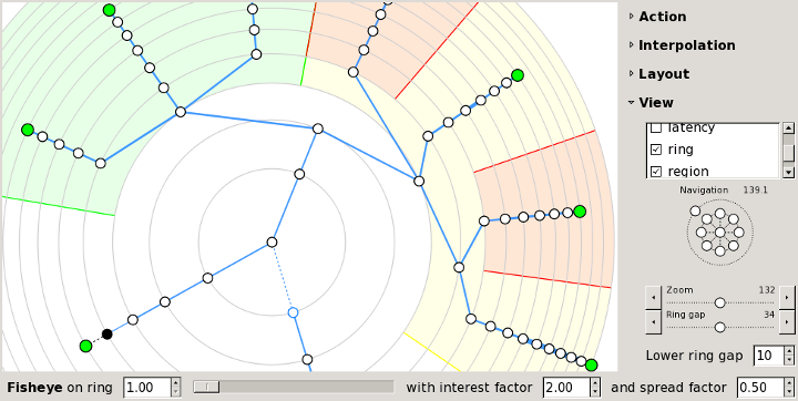
I just wrote a blog entry about some ideas of displaying time in link graphs. This is a problem that has bugged me for a while and I still don't have a good solution. The blog entry outlines some ideas and alternatives. Maybe you have a better way to visualize relationships and time in the same graph?
I have made a minor change with regards to letting people post comments to discussion entries. It used to be the case that anyone was able to post comments on the site. Unfortunately that meant that I got spammed quite badly. I realized that I had a huge approval queue for comments. I went through some of them and published them. Sorry if I deleted a comment of yours. Please repost if your comment got lost.
From now on, new comments can only be posted when logged in. Sorry for the inconvenience, but this should help a lot to make discussions more interactive through the comments.
Thanks for everybody that commented on broken links and such. I hope I fixed everything at this point. As always, if you have any input for the site, please let me know. Either by sending me an email or posting something here. Thx!
Interested in getting a quick overview of Security Visualization? I am guest-blogging on IT World. There you can find a series of blog entries about how to generate your own security visualizations:
(Update 12/05/08: Fixed the links. Sorry!)
")
Today, I would like to see if the urls that are not common in the previous graph, In this graph, heatline rendering plugin is used to check with line coloration if an event is regular. In the fourth axis, you can see lines going at the bottom and red lines go there. So let's forget about this and filter to only display lines that appear above 50% of this axis.
The filter is between single quotes, just like what you'd do with tcpdump ( I actually took their code to handle this ;-) ).
This line was typed to get the graph you can see here:
pcv -Tpngcairo -Rheatline -Avirus access-wallinfire.net.pcv 'show plot > 50% on axis 4' -ra > picviz-uncommonurls.png
If we take a random IP, such as the one we clearly see on the second axis, 213.192.60.19, and googling about it, we find that this was an infected machine. The url here tells more about it.
As a conclusion for this graph, you can see that among all those lines of log, with a very empiric approach, we really discovered something. Not a very innovative attack I admit, but enough to keep searching (I will post ongoing researches here, keep following!).
Ah, and by the way Raffy, since you asked to only display lines every few times, I added the -L option, taking a number (N) as argument meaning every N lines you display the text.

This parallel coordinates graph shows 412429 lines of one of my wallinfire.net access log with generated with Picviz svn. This is the first of a set of graphs which will derivate from this one. The most complete one.
To generate such a graph, simply use the apache-access2picviz Perl script available from trunk/tools. Then, use the heatline plugin to see line frequencies: the more green the line is, the lowest it appears. When a line is in red, it means it comes often. This way you can easily see if an event is regular or not. To generate this image, you can type: pcv -Tpngcairo access.pcv -Rheatline -Avirus -rra > accesslogs.png
First axis = Time (24 hour) with 00:00 at the bottom and 23:59 on the very top.
Second axis = Source IP with 0.0.0.0 at the bottom and 255.255.255.255 on the very top.
Third axis = HTTP request type.
Fourth = Request
Tomorrow, I will post a filtered graph, on the request axis to see what are the IP addresses that are doing abnormal requests.
Picviz is available as free software on http://www.wallinfire.net/picviz
![]() Follow SecViz on the brand new twitter feed: @SecViz.
Follow SecViz on the brand new twitter feed: @SecViz.
 As part of the ISSummit in Hong Kong, I will be teaching a one day workshop on security visualization. The following is the abstract of the training:
As networks become ever more complex, securing them becomes more and more difficult. The solution is visualization. Using today's state-of-the-art data visualization techniques, you can gain a far deeper understanding of what's happening on your network right now. You can uncover hidden patterns of data, identify emerging vulnerabilities and attacks, and respond decisively with countermeasures that are far more likely to succeed than conventional methods. The attendees will get an overview of visualization, data sources for IT security, and learn how to generate visual representations of IT data. The training is filled with hands-on exercises.
The talk is going over the following individual topics:

I am working on a Parser that transforms any kind of ASCII input log file into KML files used in Google Earth/Maps.
What does it do?
1. Reads the log
1a. Extracts an IP (column or Regex based)
1b. Extracts a node name (column or Regex based)
1c. Extracts a description (column or Regex based)
2. Retrieves a longitude and latitude to the given IP address
3. Writes a KML file for Google Earth
Why?
Well I was recently analyzing a big set of IDS events with abut 99% of false positives. Most of them originated from partners of the company located in England and France. Only a few of them - the real positives - originated from countries like Iran, Pakistan, Brazil, Russia and China.
That way it was really smooth to determine the real attacks and leave the false positives aside.
The picture is an animated GIF. Hope this format comes through. :)
It shows an analysis of a mod_security log file.
I'll provide a download link for the script soon. (the sticking point is the GeoIP database; most of them are commercial ones; currently I use TOR network and a GEO IP web service to determine the LAT and LON parameters. That should not be the final solution, right?!)
---- Update -----
I use a local database now which makes it very - Very - fast. It parses 8500 mod_security events in 10 secs. The resulting KML file has 5 MB. I generated a new picture set showing all events of 9 month placed in a world map. And I have to say ... "bad - bad bad Italy!". I am quite sure that this was the spreading of the MPack Malware Kit this spring.
--- Update 2 ---
I advanced the script with an option to define a source and target IP address to draw lines in the world map. Nice, isn't it? Now it is possible to parse log files with source and target to determine the connections between the nodes. Targets are marked with different icons.
 I recorded a short, 10 minute video where I am interviewed by Johnvey Hwang about the Applied Security Visualization book. We are talking about why I wrote the book, what the book is about, and also quickly talk about DAVIX. Tune in.
